#yeahh a redesign
Explore tagged Tumblr posts
Text


ding ding eququius BARBARITYSTUCK lil redesign?????
#equius#equius zahhak#hs equius#homestuck sprite edit#homestuck#homestuck equius#barbaritystuck#sprite edit#barbaritystuck equius#yeahh a redesign#redesign
14 notes
·
View notes
Text
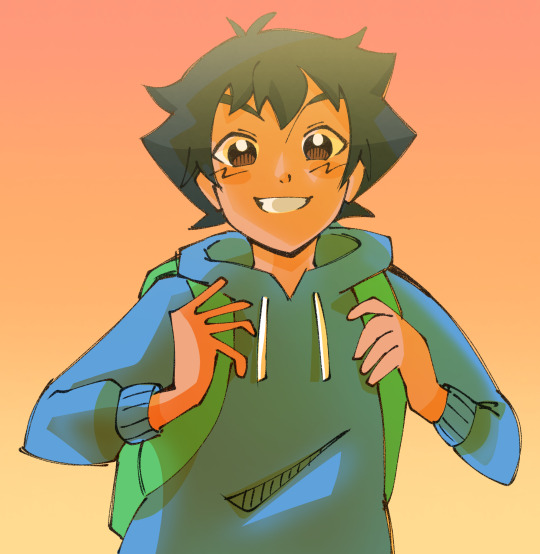
going on an adventure again
#mew.jpg#pokeani#ash ketchum#no rat because i cant draw animals well#anyway. hi#i haven't posted art in uhh. a while#ive been drawing a lot though but mainly oc stuff#that i haven't posted because i don't feel like it's ''good enough'' yet#which i know isn't a good mindset#but it also motivates me to keep drawing more so. eh#im working on redesigning all my ocs so it's taking a while#so yeahh. hopefully ill finish and post them soon because im excited to talk about them#idk when next time ill post art will be LOL#prooobably in a looong time. eh
192 notes
·
View notes
Text
cabloon / /
Silver spoon's hardcore third wheeling 🫶


#osc#object shows#inanimate insanity#inanimate insanity fanart#osc art#ii#object show community#ii fanart#ii cabby#iii cabby#ii balloon#ii silver spoon#iii silver spoon#Oooohh spoilers to my redesign² balloon#..and silver#CABLOON QPR YEAHH 🔥🔥🔥🔥🔥🔥🔥
94 notes
·
View notes
Text


I always wanted that Arlecchinno ended up being the fucking Sundowner of Genshin Impact, i wanted to have the worst person you ever withness as my main.
So i redesigned her around this idea, hope you like it!!

Also, here's a little drawing of how her cinematic would look like
#genshin impact#arlecchino#arleccino genshin#redesign#concept art#EVIL Arlecchinno yeahh#my artwork#digital art#sorry the text is in spanish
27 notes
·
View notes
Text


YEAHH I did it!! murderous husbands is ready uwu finally I pleased with Kaon design, Kaon in cape aahhhh😩🙏 I really never liked his jacket
I tried to make the designs without the robot details and I think they're looks pretty good
I feel so tired, but maybe later I also do Helex and Tess redesigns, I'm not changing Vos' outfeet bc I really like him, my favorite
#transformers#djd#kaon#tarn#idw kaon#idw tarn#maccadam#mtmte#idw#humanformers#humanization#transformers idw#tf art#tf fanart
338 notes
·
View notes
Text
still realizing stuff about Ink's redesign years later after the party ended has been kinda crazy because oh yeahh....his speaking font (note this) is supposed to be similar to japanese ink writings........because he was inspired by a sumi brush.......and that's why he was designed after ukiyo-e representations of samurais from the edo period.........and that's why he's called 'ink' and has a brush and cool ink powers and stuff.......and that's why his musical themes sound like that....... how have i not realized that before......the stars are aligning........my brain is growing.....
86 notes
·
View notes
Text
GHOULA & LAGOONA REDESIGN 🗣️🗣️
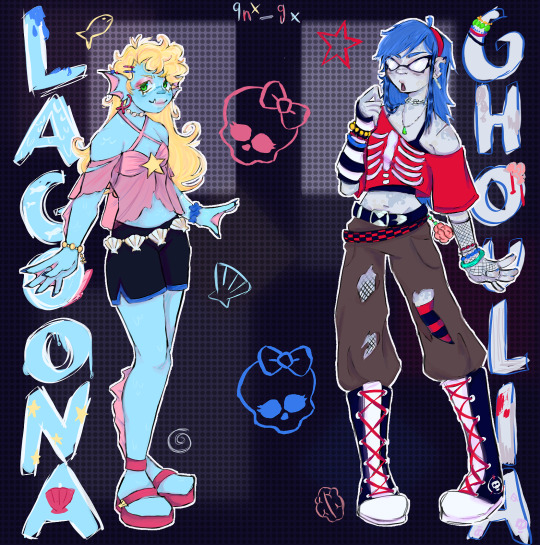
I really wanted to redesign those two for a while now and I'm happy that I finally did it !
Lagoona was supposed to go into the gyaru direction but I still wanted her to not have thaaat much accessoires and be a bit sporty so yeah-
And I didn't draw Ghoulias eyes because I tried but it kept looking weird, so I just left it 😔
So yeahh, enjoy !
#art#digital art#drawing#monster high redesign#monster high#ghoulia yelps#lagoona blue#monster high lagoona#monster high ghoulia#my art
151 notes
·
View notes
Text
ohh yeahh.. i probably forgot to post these two. (Take a human redesign of Ezer too.)


#shitpost#digital art#artwork#sketch#roblox pressure#pressure roblox#pressure#pressure oc#drawing#ezer solace#pressure fanart#roblox games#roblox oc#roblox fanart#art#art oc#art on tumblr#art digital#art blog#artists on tumblr#artist#artist of tumblr#character art#artists of tumblr#digital artist#digital artwork#digtal art#my art#my artwok#my artwrok
49 notes
·
View notes
Text

YEAHH HALLOWEEN-
in may-
Yep, I was bored so I decided to redesign their outfits and also add Blake! (sf sans) I might change his name. I might make a nice fancy illustration with these designs. Maybe
I might also adjust their heights. DD would be her normal 4’10. But I want rus to be hugggeee, kind of like a demon wolf instead of a regular warewolf
#art#myart#my art#digtal art#digtalart#undertale#sketch#undertaleau#sans#papyrus#Sf papyrus#Sf sans#Rus#mutt#blake#black#dd#persona#self insert#redesign#halloween#witch#warewolf#vampire#reference
84 notes
·
View notes
Text
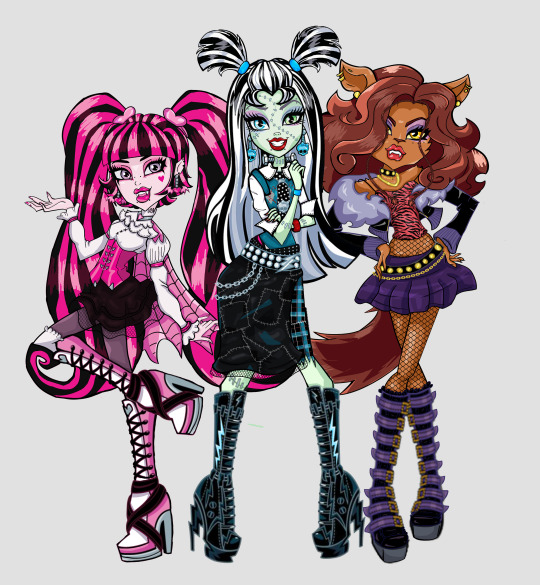

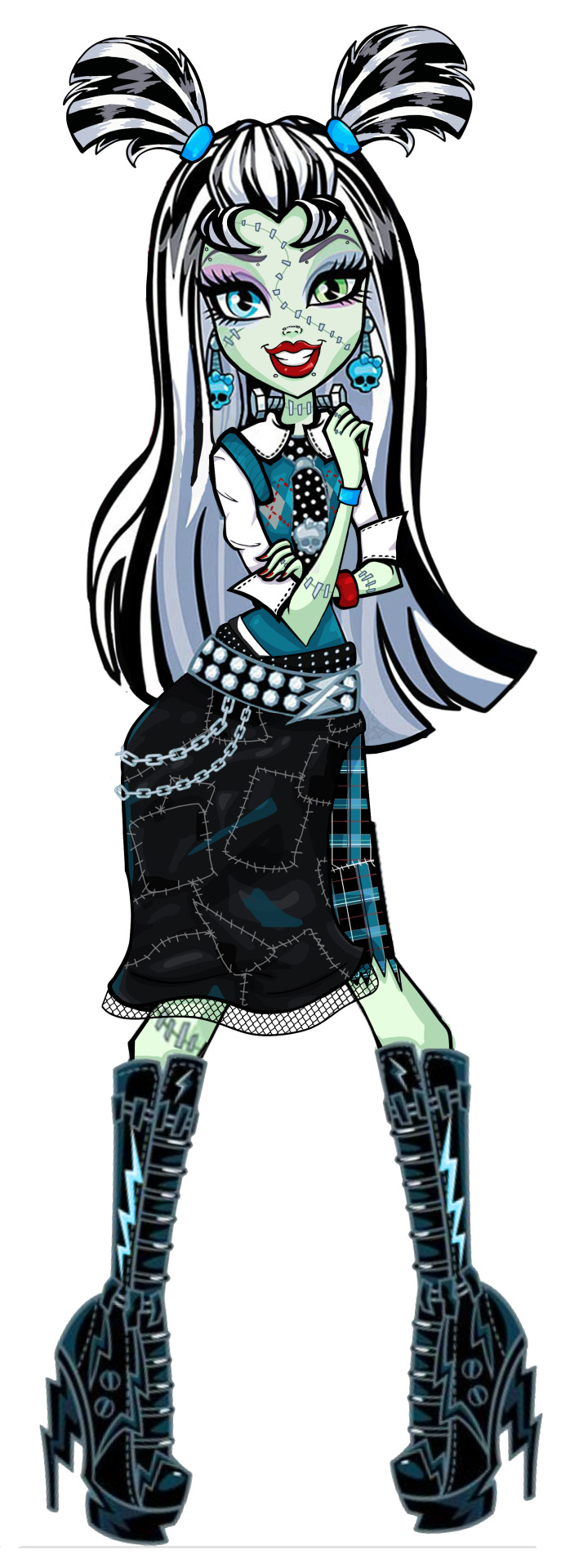

Monster High redesigns as my first post :D starting with the main trio! Draculaura, Clawdeen and Frankie (all g1) yeahh these are mainly edited images with some bits being drawn by me, but I'm having a lot of fun with them! I'm planning to do Lagoona, Ghoulia, Cleo and Deuce next! now just to learn how this site works LMAO
uhh yup
#monster high#monster high redesign#monster high g1#monster high draculaura#monster high frankie#monster high clawdeen#monster high fanart#frankie stein#draculaura#clawdeen wolf#frankie stein g1#draculaura g1#clawdeen wolf g1#frankie stein redesign#draculaura redesign#clawdeen wolf redesign
149 notes
·
View notes
Note
hi i know you said ask again a week from now so here i am lolll. is there an update on your "Residences for Ciudad Enamorada" lot :)?
Hiii babe!!! sooo... you're gonna hate me for this 😭😭😭 but I started working in one of the apartments, but I decided to start in a very modern one... and apparently right know I'm in my more trashy/middle class(?) era lmaoo. So I felt overwhelmed with that fancy ass build and I stopped working on it 😭😭 I stared working in a "normal" area for me, I'm literally taking inspo from the streets near by me home lmaooo 🙈🙈

BUT LUCKILY, I did some research about mexican colonial builds (I literally watched just one fucking movie lmao but that gave me a better idea and I started to remember more scenarios where I know how they look on the inside hehe) and I came with a couple ideas.
So for me, the overall floorplan idea is this:

as you can see and if you remember, these apartment residences were really big homes in the past so when they started dividing the home into multiple unit apartments, this units were usually one of two divided spaces and they're usually connected each other by doors and sooome of them may have hallways but the reality is that the main hallways were almost always outdoors. The doors to the bedrooms are even outside you can see it in the picture above. In the modern days, this units were converted in loft studios with an added bathroom (the units used to share bathrooms and kitchens before T_T insaneee) and for the bigger ones you normally need go through the kitchen then the living room to enter to the bedroom, there's no hallways, you need to almost walk every single area of the home to your bedroom.
These are the only two units I changed to a more accurate floorplan for now (at least what I think) and I added some extra info so you know how they're divided :D ***sorry i added an extra n in dining OOPS


I think you can now have a better idea in how I divided them as you can see, there's really not hallways in the units. I think the only time I'll use hallways will be for bigger units with more than one bedroom. I did a quick redesign of another unit, and this is the floorplan I ended up with:

This one was little hard to come up with because I have no fucking idea how to make this one work because I don't think they're supposed to be this big irl, So I'm not fully convinced on this one. I'm not loving how big the living and dining area is buuut this was the most accurate version I can think of lmao. So, those are the options I can give you now. If I come with better floorplans I'll let you know anon!! Lately I been watching a lot of videos and reading about mexican architecture so I might know better soon lol but honestly its been like really hard to find info about this, ugh so frustrating.
*** I just had a little thought about this, and I can't show you because I already closed my game BUT I was thinking that another great floorplan for a two-bedroom unit could be this one, please dont mind my silly ugly drawing buuttt yeahh... the black lines are doors, I think the best way to blend in a hallway is definitely a door, an open hallway concept looks a little weird to me idk

I'm still thinking whether I'll share this build or not… maybe I will!!! but IDK IDK I'm not fully convinced yet 😭😭 I just don't feel like sharing cc builds but IDKKK lol
26 notes
·
View notes
Text
ask answering!!
u know what time it is!! askposting!! feat. jedi academy, skywalkers apart au, and me being sad abt not playing survivor lolll
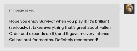

@minpage thank you both!!!!!!! gotta last out til mid november (Im absolutely buying it for myself for my birthday) and then this blog is gonna be on cal kestis lockdown for whoever knows how long LOL
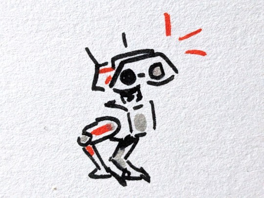
also woe, sketchbook bd-1 be upon ye

i have not!! the only anime ive watched is spy x family loll
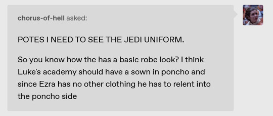
@chorus-of-hell IM GONNA GET TO GIVING ALL THE ACADEMY JEDI BETTER DESIGNS AT SOME POINT (except luke he's already got half a redesign going on) but there isnt a proper jedi uniform they all just wear whatever they feel like w robes
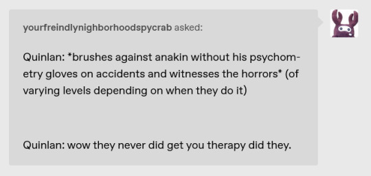
@yourfreindlynighborhoodspycrab LMAO omg quinlan's gonna need therapy after seeing like 4% of anakin's life
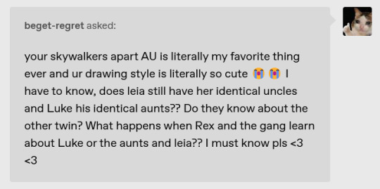
@beget-regret aww thank you so much omg!!!!!! unfortunately leia just has rex ): the rest of the 501st have their canon fates sob. luke does have all the handmaidens tho!!!
and yeahh they all know abt the other twin bc anakin told rex and ahsoka abt What Happened when he reunited w them and the Handmaidens have been around helping with the deception since day 1, so they all know abt everything! theyre the only ppl in padmes life aside from bail who DO know

@finwe77 cal indoctrinated them asap. aaren (human, not pictured) and sayuri (togruta) were definite holdouts but sayuri seceded bc her bestie Zakhar wanted to match, and Aaren probably just got cold and stopped being annoying abt it
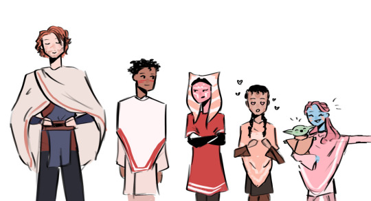

i would potentially have to say luke spooned someone to death if it was...
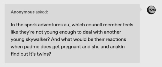
sorry i was gonna answer this w an art but now i cba so its been in my inbox forever LOL anyway they're all too old and they all gasped in horror to say "oh force there may've been a second sporker out there..."
#skywalkers apart au#as always if ur ask isnt here im probably drawing for it (or uh it may be ignored. the anon hate is in the latter category)#thanks for the ask!
114 notes
·
View notes
Text
Ohh,, oh yeah I redesigned my tf oc Tempo again,, uhmm yeahh ✨

DIVAA 🔥🔥🔥
#oc#original character#original characters#transformers#macaddam#Tempo#androgynous#nonbinary#genderfluid#bisexual#oc refrence sheet
11 notes
·
View notes
Text

haii... i drew again for the first time in BILLIONS OF YEARS! do you like it. i hope so! as you can SEE ive "redesigned" my sona but its moreso just updating that little dude to reflect me as i am NOW. the outfit is my current outfit what im wearing RIGHT NOW as of posting. yeahh some call me a fashion genius but i stay modest about it. this is an update post, big text wall incoming!!! keep reading... if you DARE
sorry fireandkimstone nation ive been neglecting you lately. you guys are all so awsome i heart all of you!!! i never really talk about this publicly or even privately that often but this past year from around april to now has been really hard on me. end of a 2 year long relationship, lots of lost friends and a huge workload at school has rung me dry entirely of motivation to do likeeee anything but shitpost online lol. overall just a big drag of depression my room was messy as shit i did the bare minimum in taking care of myself i was losing interest in all of the things i enjoyed slept through all the days i could etc.
but!!! im not sure what changed but i feel a lot better at least for now!!! got a short-term project to keep me busy, weeded out all the friends that were bad for me, im more interested in my passions again, buying more free time for myself and taking better care of myself generally. probably will be posting a lot more personal stuff on here!!! i tried to make sure all the shit i was going through wasnt affecting how i acted around people or the quality of anything i was doing but this fall i kinda failed on the matter lol. but now that im feeling better i shall be better about that... i return to you, fireandkimstone nation...
anywayyy back to the art. havent drawn anything for a while (read prior paragraphs), i hope this is good!!! she kinda looks like a mii. i luv her. while i was drawing this and my new pfp (do you like it btw. i do my favorite part is the hat) anthony " @azspam " zoxide fucking KIDNAPPED ME and FORCED me to watch his strange little minecraft guys. let this be a lesson in multitasking... tch. loser

#sillyposting#art#kimmers art#garfield#i fucking LOVE garfield#what did i used to tag these ermmm#whatever. itll find its people#:3#i feel so :3!
8 notes
·
View notes
Text
Wordgirl OCs time, yipee!!! Yipee!! I drew these like a month ago but yeahh.


*Finally* redesigned Eme again, my first Wordgirl OC. Hopefully, I can draw more of her, mi hijita! And then we have my attempt at redrawing Edith and Thrash (he's technically not an OC but whatever i changed him enough to be one) they're left unfinished but expect them and Eme and a another OC to be drawn more often.

And an experimental drawing of Iram, they're an OC that won't matter lore wise for a while but I drew em anyway.
#wordgirl#wordgirl fanart#wordgirl ocs#eme ezperanza#Edith McCallister#General Thrash#i wanna ramble about them. somebody who is curious send an ask/Lhjjjjj
18 notes
·
View notes
Text
Rating Every TNBA Redesign Cos Why Not
The New Batman Adventures was the last season of the infamous Batman the Animated Series, although it moved to another less strict network. Because the producers wanted to do crossovers with the Superman animated series, they gave the series and its characters a more streamlined style to it. Now I dont wanna blame Bruce Timm entirely since there were many artists on staff back then who did the redesigns but because I hate this coomer, Im going to anyway. In BTAS, you can tell each character apart and they have their own unique outfits and looks to them. But here, these are some of the most unimaginative superhero/villain designs Ive ever seen. Although some did surprise me and were not that bad. So, for a bit of fun, here's my look at each Batman character's redesign in the final (and worst) season of the show.
(Not counting Robin cos he's a different character to Dick Grayson or characters that had very little changes like Clayface or Harley Quinn)
Batman
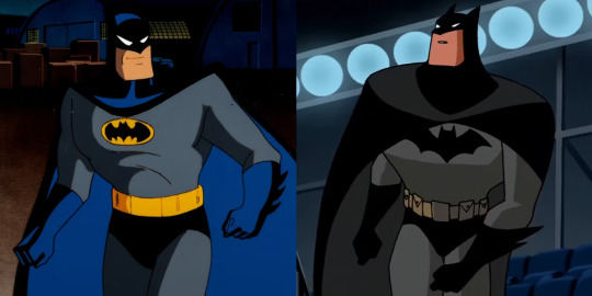
The big emo rodent himself. For his redesign, I like the more sleek look to Batman's cape...thats it. His original design is really hard to perfect. Its got everything. Why tamper with perfection?
Batgirl

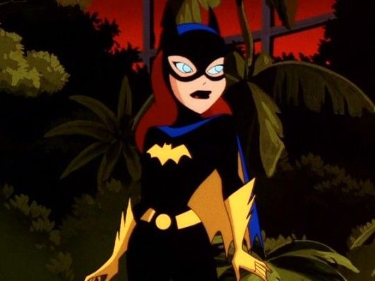
I actually kinda like Batgirl's redesign. The yellow gloves and boots really help her stand out and its the one of the few times the darker toned outfits actually accentuate a design rather than ruin it. Too bad Bruce Timm couldn't stop salivating over her and the rest of the women in this show. So next time you see someone consider Bruce Timm this legendary storyteller of Batman, give them a healthy reminder that he shipped this college girl character with her mentor/surrogate uncle figure FOR YEARS.
Alfred
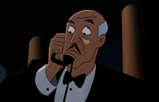
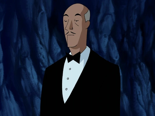
Its like they sucked away all of Alfred's snark and replaced it with a cardboard cutout. Literally, he looks so sterile and empty. Who had the idea of making Alfred look more bored and done with everything? Also whats wrong with his chin??
Commissioner Gordon
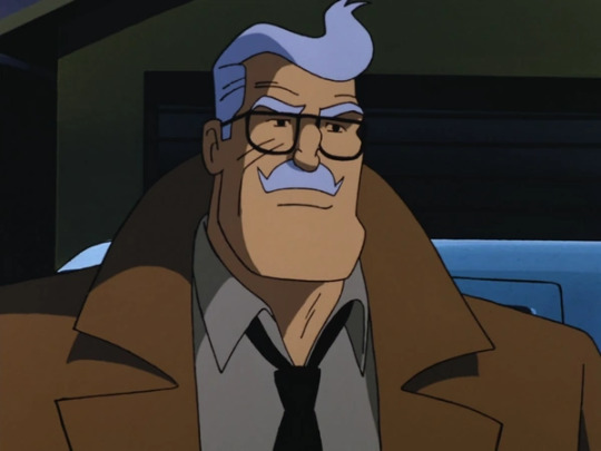

Good ole Commissioner Pringle got off pretty much unscathed but I think they made him a touch too old considering they gave him a more lanky body, which makes him look more feeble and weak. Dude looks old enough to be Babs' grandad
Joker

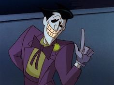
Ohhhhh boy. So Joker's redesign is infamously considered by fans as one of the show's worst redesigns, to a point even the showrunners were like yeahh. And thats not unwarranted. He looks like an inverted Dr Draken and im so glad they redesigned him again for Batman Beyond and onward.
Seriously he's A CLOWN WHERES THE MAKE UP?!!
Two-Face
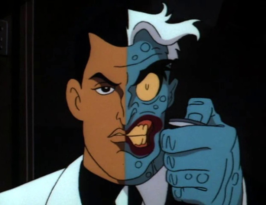
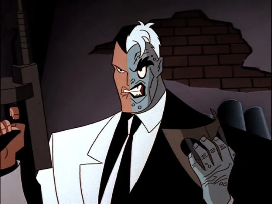
I know Two Face is just a redrawn version of the original design with the TNBA streamlined art style but I want to draw special attention to the monster side of Dent's face. Notice in the original it looks more manic and feral? Heavily contrasted with the conflicted, guilty look on Dent's normal side? But here, in the redesign the monster side is less scary and Dent looks way too bored and angry. The overuse of black lines doesnt help.
Catwoman

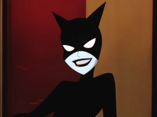
She looks like Harley Quinn or Barbara wearing a catsuit. Starting to see a pattern here?
Baby Doll

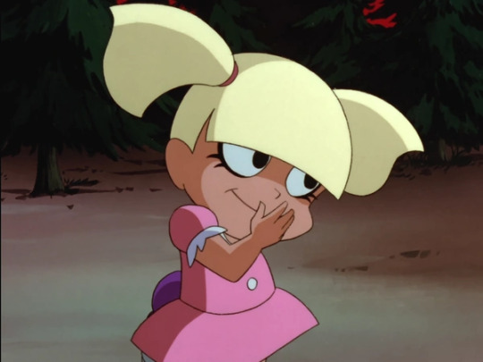
Its a tough call cos they both look very good but Im gonna lean towards the redesign cos shes got that creepy doll look down to a T (Annabelle would be proud) whereas her original design looked more like a Tiny Toons character.
Scarface and the Ventriloquist
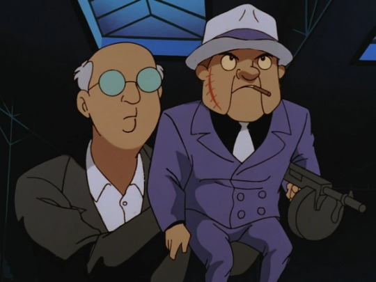
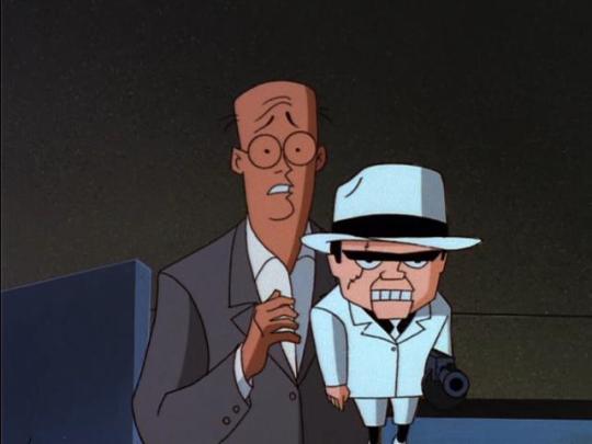
I like the redesign cos of the exaggerated style of the rest of the show perfectly captures Scarface since he's, yknow, a puppet and having the Ventriloquist be shown to be scared and submissive really does show how the puppet is ironically the puppetmaster.
Penguin
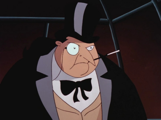

Actually I like both of them. They both give off that sophisticated element Penguin is known for and after so many reiterations of him being this crass Scouse-talking crime boss, its nice to see versions of him going back to his rich asshole roots.
Bane

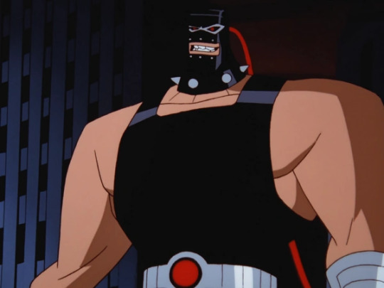
In the original, he has a luchador-style mask and wrestling suit fitting his Spanish roots. Here, he straight up looks like a gimp. Its really bad. Embrace your heritage, Bane!
Riddler
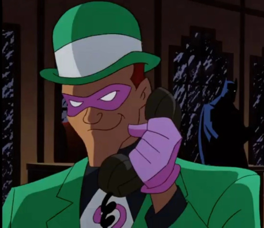

They went from Frank Gorshin to Jim Carrey for Riddler (fitting cos Batman Forever came during TNBA's development) and I love that. So I love both of them. Nice to see a villain with some fucking colour in TNBA cos im tired of seeing all this black outfits. Also his cane being an extended question mark instead of a question mark on top of a regular cane is genius.
Mad Hatter


Both of them fit Hatter's deranged stalker vibes perfectly, but I wish they kept the colour scheme for the redesign cos Hatter's new colour scheme looks too rounded and doesnt stand out.
Poison Ivy
Killer Croc
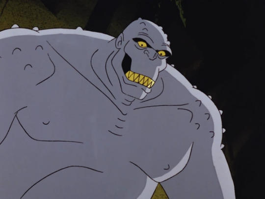

Finally, now he looks like an actual crocodile instead of whatever the hell he was supposed to be!
Scarecrow
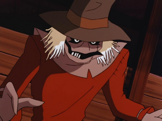
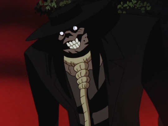
Okay, who the fuck decided to make Scarecrow look like the Babadook? Cos I want to give them a raise. Holy mother of piss, that is terrifying. That shit belongs in the Arkham games. I still prefer the old design cos it has that perfect blend of goofy and gothic. He looks like a Cacturne now that I think about it.
Mr Freeze
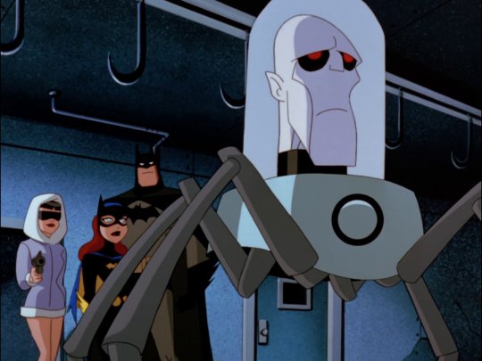
HONEY WHAT HAVE THEY DONE TO YOU?!! WHY DO YOU LOOK LIKE A FUCKING FUTURAMA HEAD?!! WHAT IN THE ACTUAL FUCK?! YOU HURT MY HUSBAND, TIMM, NOW ITS PERSONAL
#batman#batman animated series#btas#the new batman adventures#tnba#batgirl#commissioner gordon#catwoman#joker#riddler#two face#penguin#the scarecrow#mad hatter#ventriloquist and scarface#baby doll#poison ivy#bane#killer croc#redesigns#mr freeze#also freeze's suit looks so robotic and lifeless which I know that was the intention but it still looks boring as fuck
161 notes
·
View notes